


 Gold-dev
 March 14th, 2023
 0 Comments


Air Canada’s Livery Evolution
As a carrier that began in 1937 as Trans-Canada Air Lines, Air Canada has a long history of serving Canada and connecting the world. The carrier has also experienced an interesting evolution of liveries over the decades. We will look at how the airline’s style has changed throughout its history in this article. Air Canada has gone through one name change and several livery revisions, most recently on January 1st, 1965. The carrier actually began its life as Trans-Canada Air Lines but took on its current name on January 1st, 1965. We’ll only take a look at the carrier’s mainline fleet while excluding the aircraft of its regional subsidiaries, as well as Air Canada’s special one-off liveries or low-cost brands.
From TCA’s inception to the 1960s
When Air Canada began as a government-run carrier, it was known as Trans-Canada Air Lines, or TCA. Its first decades had mostly bare metal aircraft, which was relatively common at the time. There were red and white cheatlines along the fuselage, which said “Trans-Canada Air Lines” in red letters above. TCA later started featuring white tops with bare grey-metal belly panels, and Air Canada revived the look of its early TCA days with a retro livery on an Airbus A220-300 (shown below, 2nd image).1960s to 1990s: Officially Air Canada
It was inevitable that the airline would have to change at least part of its livery to reflect its new identity. However, the airline went one step further and radically altered all of the airline’s liveries. As a state-owned entity until the late 1980s, Air Canada’s aircraft wore a red and white color scheme, reflecting the national flag. A maple leaf ’roundel’ was introduced with the eye-catching red, along with the airline’s new logo (a small disc that is used as a decorative medallion or symbol). You may also have encountered the blue, white, and red roundel of the Royal Air Force, or the logos of different lines of the London Underground.During this time period, the cheatline-look remained quite common in the industry.
There was a slight change in the red and white cheatline during the early-mid 90s, with Air Canada darkening the red on the tail and adding a darker red band across the fuselage, as well as a light gray tone on the aircraft bellies.The 1990s and early 2000s: Ditching the cheatline
After Air Canada was privatized in 1988, it decided to change its livery yet again in order to reflect its new identity. During this period, the airline dropped the cheatline in favor of a mostly white fuselage. In addition to replacing the tail roundel with a more detailed maple leaf, the Air Canada wordmark on the fuselage was revised as well, including the roundel. Despite our promise not to cover special liveries, one of Air Canada’s jets was painted in the Star Alliance livery as it was a founding member of the alliance. It is still common practice for Air Canada to maintain several aircraft in a simple Star Alliance livery to meet the requirements of most alliances these days.From the 2000s to the mid-2010s, there has been a radical shift
From around 2004 to 2016, Air Canada had a light turquoise fuselage color. This enabled the maple leaf graphic on the tail to be more prominent. From the looks of it, the carrier also ‘beefed up’ its fuselage wordmark, making the words “Air Canada,” as well as the roundel, larger and thicker. Engines would also have the same color as the fuselage. Since this is the airline’s second most recent livery, some aircraft still wear it.Air Canada’s current livery: Back to the future
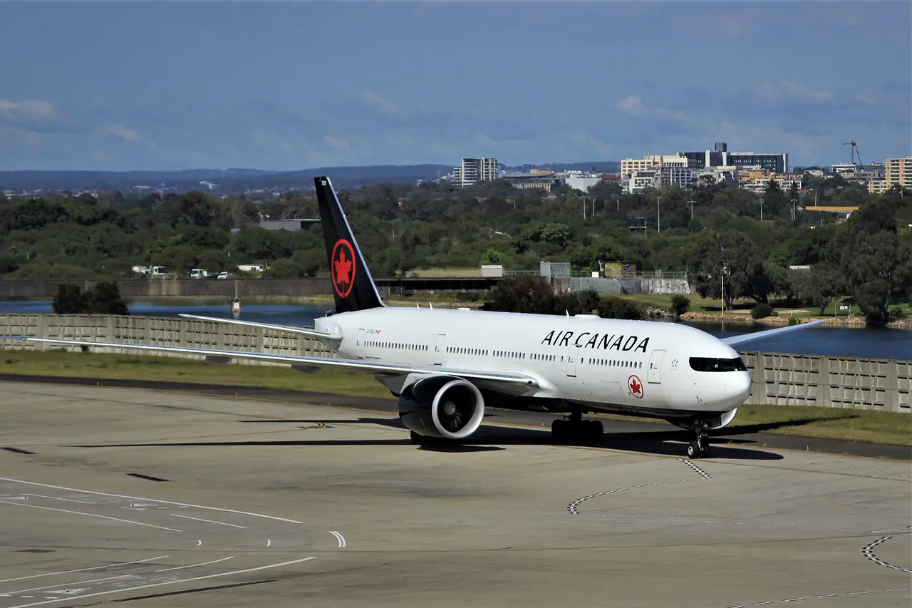
A little bit of a throwback from the 1990s, although Air Canada’s current branding isn’t exactly a ‘retro livery’. With a few modern touches, the airline is back to white, red, and black. Firstly, the roundel has been reintroduced to the tail. This symbol is bold, red, and sits against a black background. A black belly is painted on the jets and black engines are also part of the new livery. The Air Canada wordmark remains on the fuselage side, but the roundel has been separated and now sits below the window line. One of the most striking features of the carrier’s new livery is its ‘cockpit mask.’ It is reminiscent of the cockpit outline on newer generation Airbus jets, albeit bolder and larger. There is, however, a unique style to Air Canada’s cockpit outline, which is relatively flat at the top. The bottom black edge bends upwards to meet the top line at either side. In addition, many airlines have used cockpit masks as a design feature to give their airplanes a fresh look, not just Air Canada. In July 2021, Portuguese wet lease airline Hi Fly posted on YouTube a video showing off its latest aircraft- an Airbus A330 with a similar design. Alaska-based Northern Pacific Airways has painted the cockpit mask on its recently acquired but older aircraft. A cockpit outline has also been painted on Eurowings Discover’s older aircraft.RECENT POSTS
Pegasus Airlines neemt Smartwings en Czech Airlines over voor 154 miljoen euro
Pegasus Airlines neemt Smartwings en Czech Airlines over voor 154 miljoen euro
The psychology of travel: How to avoid stress and addictive habits in airports
Why Flight Trackers and Casino Players Use the Same Risk Assessment Skills
Online Casino Games for Aviation Enthusiasts and Travelers
META
CATEGORIES
Leave a reply